The purple color palette in films is very rarely seen these days. A filmmaker uses visuals as art of expression. Mastery of the color palette is required to be a great visual artist. Many of the best directors, cinematographers, and production designers come from a long legacy of visual artists. Color can be used in a variety of ways in movies.
Researchers have been examining what colors indicate in art for several years, as well as how, from the perspective of psychology, a person sees different colors, because most of the time we are not conscious of what causes us to feel a certain hue. Then we looked at these researchers and came up with a few theories on what purple may imply in cinema, which we then matched up with movies. No we are not talking about black and white to color, we are talking about how to use color to convey an emotion.
In Indie filmmaking world, one of the most underappreciated aspects of the filmmaking process is the color palette. It can mean the difference between completely immersing your audience in a universe and boring them to death. Color generates atmosphere, intensifies emotion, and emphasizes meaning. This is why directors, cinematographers, and production designers select color palettes in preproduction, well before filming begins.
Crafting a Film’s Color Palette
Color in film is not just about aesthetics but a potent narrative tool. The colors you see on screen can set the tone, mood, and even influence the emotions of the audience. Here’s how filmmakers curate a movie’s color palette to tell their story most effectively:

Initial Considerations: Production Design and Costumes
Every film begins with a vision. This vision incorporates the story, characters, and the world in which they live. The color palette is central to bringing this world to life. It begins in pre-production, where the production designer, in collaboration with the director, conceptualizes the look and feel of the film’s universe.
One of the foremost aspects to consider is the setting of the film. For instance, a period drama set in Victorian England would predominantly feature muted, earthy tones, while a sci-fi set in a futuristic metropolis might embrace neon and stark contrasts.
Costumes play an equally pivotal role. The hues and textures chosen for characters’ attire can communicate personality traits, societal roles, or even their current emotional state. For example, a protagonist donning a bright red dress might symbolize confidence, love, or anger depending on the narrative context.
Significance of Set and Character Dressing
The color palette is also influenced by the props and furnishings in the scene. Filmmakers use these elements to emphasize (or sometimes contrast) the primary color scheme of the film. Consider the lush green backdrop of the Shire in “The Lord of the Rings” or the eclectic pastels of Wes Anderson’s films. These choices are not merely decorative; they immerse viewers into a carefully crafted reality.
Lighting in Filmmaking: Color Temperatures, Gels, and Hues
Lighting can make or break the intended color palette. Different lights produce different colors, even if they appear ‘white’ to our eyes. For instance, tungsten lights give off a warm, yellowish hue, while fluorescent lights can appear bluish.
To manipulate these effects, cinematographers employ gels – colored sheets that can be placed in front of lights. With advancements in technology, LED lights now allow for digital adjustments of color on the spot.
Contrasts are also crucial. By having different areas of light and shadow, filmmakers can create depth, highlight specific characters or objects, and emphasize the mood of a scene.
Post-production Color Grading and its Techniques
Once the film is shot, it enters post-production where colorists further refine the movie’s visual aesthetics. Using software like DaVinci Resolve or Adobe Premiere Pro, they adjust the RGB values to bring out specific tones, add effects, or correct any inconsistencies.
Color grading also allows for stylized choices. For instance, a film could be given a sepia tone to invoke nostalgia or a blue tint to create a cold, desolate atmosphere.
Why is purple an essential color and you must include it in your movie?
Purple has been connected with sensuality in the past, particularly in romantic tales and poetry. Purple, on the other hand, was never connected with sensuality over our more than two decades of research into the impact of color on behavior. In fact, there appeared to be no proof that purple had any effect on the physical world. However, in the domains of the non-corporal, magical, and even supernatural, the color held a great effect.
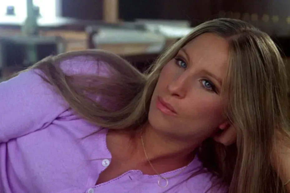
Purple is a color associated with grief, separation, and death.
Purple may represent the end of a relationship, dreams and illusions, as well as different types of loss, including death.
1. Cabaret (1972)
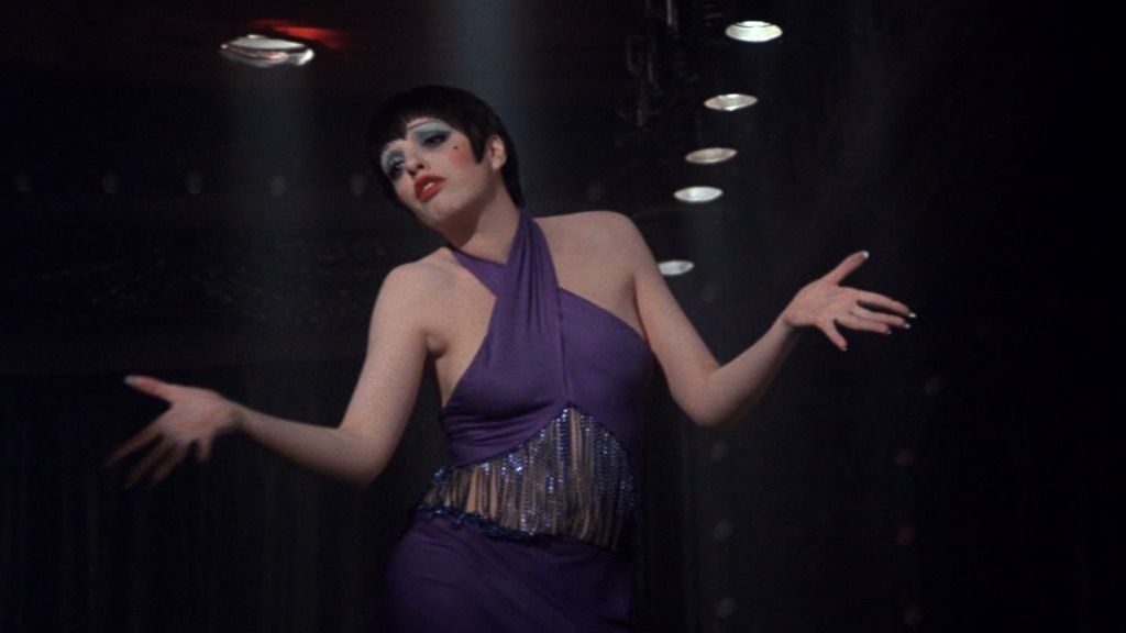
Hitler is on the verge of assuming the presidency in Berlin in 1931. Sally Bowles, a native of the United States, makes her income as a cabaret singer in her hometown. She meets the novelist Brian Roberts, who has travelled all the way from England to meet her. Sally tries to have an affair with him, but it doesn’t work out and they wind up becoming friends instead. As a result, Sally develops a romantic involvement with Maximilian, a wealthy hedonist. The connection between the individuals in the film is steadily becoming more complicated, and Sally will be forced to make a number of tough decisions at the film’s conclusion.
When it comes to the final musical performance that Sally will perform in the film, the singer opts for a purple outfit in terms of purple color palette. In a short time after this picture, the girl would lose the person who loves her, her unborn child, as well as the familiar surroundings that will soon be altered as a result of Nazi rule.
2. Rushmore (1998)
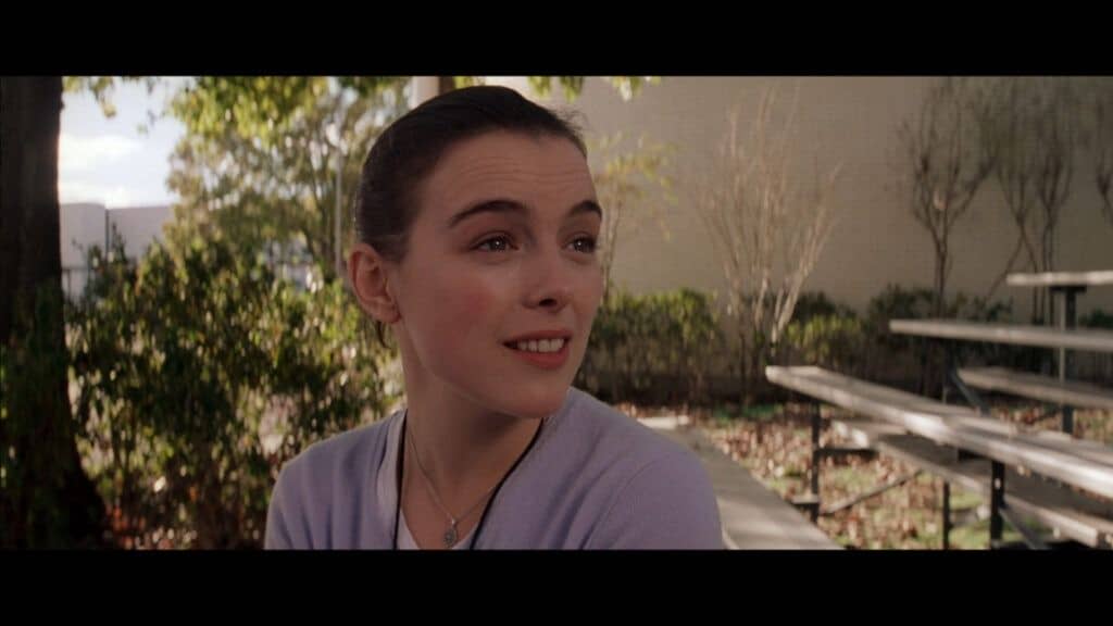
Max Fischer, a student at a famous school, aspires to be successful in everything at the same time: he manages an educational newspaper, participates in school leisure organisations, and puts on plays. Unfortunately, all of Max’s extracurricular activities are detrimental to his academic performance, and he is in desperate need of improving his grades. Due to the fact that the adolescent has developed feelings for a much older teacher, the issue becomes more problematic. Max makes an attempt to win her over and imagines what their future together would be like.
Wes Anderson is well-known for meticulously selecting the color palettes for his films, and so did he do for this film. Throughout Rushmore, there is a lot of purple. Rushmore is a prime example of how to use purple color palette in your films. For the role of Max Fischer in this film, 1,800 youths from the United States, Canada, and England were auditioned.
Purple is a color associated with illusion, and in Max’s case, delusion and the spiritual, therefore it has little influence in the mundane domain.
Wes Anderson and Owen Wilson wanted to make their own “somewhat exaggerated reality, like a Roald Dahl children’s book” with this film. This is a must-see film!
A color associated with missed chances and something that did not take place is purple.
The display of purple on the screen might indicate that the heroes have lost out on chances, or that they have made poor judgments.
3. The Bridge of Arts/Le pont des Arts (2004)

It takes place in Paris, and the primary protagonists are a student named Pascal and an aspiring singer named Sarah. They have the potential to be the perfect pair, but they are unfamiliar with one another and are both suffering from relationships with the wrong individuals at the moment. Pascal makes the decision to commit suicide one day and plays a record of a Baroque orchestra, with Sarah singing in the background, to help him get through it. Pascal’s attitude is changed by the beauty of the music and the honesty with which the vocalist expresses her thoughts; he falls in love with her voice and resolves to look for a girl. Unfortunately, they will never see one other again.
Pascal and Sarah never have a chance to get to know each other in the film, but there is a scene in which they do so: Pascal is sitting in a cafe reading a book in the rays of violet light when Sarah walks in, but he sits with his back to her; then Pascal leaves the room for a short while, Sarah finishes her coffee and leaves, and Pascal returns for a book and an account before leaving as well. Except for the main characters and the single employee of the institution, the café is completely deserted during this sequence.
- Also Read- 10 Best Short Films on Mubi To Watch In 2022
- Also Read- What is lens flare in filmmaking? Secret recipe to cinematic storytelling?
- Also Read- 10 Common Mistakes Made by Amateur DP/Cinematographers
Purple is considered to be the hue of mysticism, magic, and extraterrestrial energies, among other things.
Purple is connected with mystical and otherworldly abilities, as well as mediums and fortune-tellers, among other things. The color purple is frequently used to signify a ball that forecasts the future.
4. Sleeping Beauty (1959)
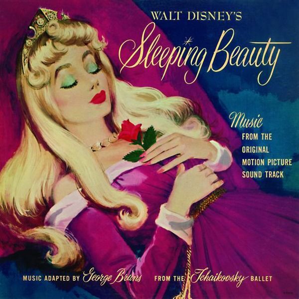
There’s an old fairy tale that goes something like this: the rulers of a magical country failed to invite an Everyone gathers to celebrate the birth of the beautiful Princess Aurora into nobility. Everything is great until the arrival of an unwelcome visitor, the evil fairy Maleficent. Maleficent curses the young princess and predicts that she will die on her 16th birthday by pricking her finger on the spindle of a spinning wheel before nightfall. Fortunately, one of the good fairies, Merryweather, breaks the spell, causing Aurora to slip into a deep sleep, from which she can only be awoken by true love’s kiss. The day has finally arrived.
While Maleficent from the Disney animated picture moves around in a black and purple dress, the costume in the film starring Angelina Jolie (Maleficent 2014) is fully black and ominous. In addition, when Maleficent, the cartoon character, works her magic, the light radiating from her magic wand is a deep purple color.
European artwork and French medieval textiles, French gothic manuscripts, and French and German structures served as inspiration for the film’s art direction.
Color purple as a symbol of an ideal, a fantasy.
The fact that purple paint was historically difficult to create and consequently expensive. As a result, only the wealthiest of the royals could buy something purple.
5. Blade Runner 2049 (2017)
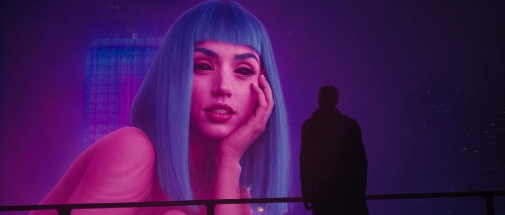
It was widely believed that the sequel to Ridley Scott’s seminal Blade Runner would be the most anticipated picture of the year. In the year 2049, Blade Runners catch and exterminate the replicants on the planet. K, one of the “running” characters, lives with Joy, a virtual holographic girl. He unwittingly comes into contact with knowledge that has the potential to dramatically alter his perception of himself and the entire universe.
In one of the most memorable sequences in the film, when K is separated from his virtual sweetheart, he strolls by interactive advertisements with identical girls-holograms Joy-and a gigantic female on a billboard flirts with him. Joy, according to the commercial, is the ideal girl, the dream girl, and everything in between. This is most likely why the hologram from the billboard is so vibrantly colored in pink and purple.
If you’re looking for a subtle approach to make a scene impact emotionally, using a color related with the emotion you’re attempting to elicit may be the best option.Color in film, of course, is a more complex phenomena, owing to the fact that our perception of color is nuanced and dependent on our upbringing and cultural background. Each film, as well as its color palettes, is distinct.
Using other colors than Purple in your narrative
- Love, passion, violence, aggression, and power are all connected with the color red.
- Warmth, excitement, friendliness, enjoyment, and vibrance are all associated with the color orange.
- YELLOW is a color that represents insanity, disease, insecurity, obsession, wisdom, and betrayal.
- Environment, ignorance, corruption, gloom, darkness, and envy are all connected with the color green.
- Cold, depression, loyalty, tranquility, inactivity, and quiet are all connected with the color blue.
- Innocence, tenderness, femininity, charming, fragile, and beauty are all linked with the color pink.
Three main elements of color
When picking a color, keep in mind that there are three key factors to consider: hue, saturation, and brightness.
- The color itself is called hue.
- Saturation refers to the color’s intensity.
- Brightness – A color’s darkness or luminosity.