
Welcome to FilmmakingElements.com! I’m excited to share my insights into a topic that piqued my curiosity when I began my journey into color grading: the ‘Color Space Transform’ in DaVinci Resolve.
For many of us venturing into the realm of DaVinci Resolve for the first time, we’re greeted with a plethora of terms and techniques. Among these, ‘color space transform’ and ‘color managed workflows’ stand out as particularly technical sounding. I remember feeling a mix of awe and overwhelm when I first encountered them.
The digital world is filled with myriad devices, each with its own way of representing colors. From the smartphone in your pocket to the high-end monitors used in post-production houses, ensuring your content looks its best across all these devices is crucial. This is where mastering the art of color space transformation becomes indispensable.
What is Color Space Transform In Davinci Resolve?
At its core, ‘Color Space Transform’ facilitates the kind of color modifications typically associated with LUTs (Lookup Tables). But here’s the catch – instead of relying on lookup tables, this plugin leverages the same mathematical principles used by Resolve Color Management (RCM). The result? Exceptionally smooth color transitions without any clipping. This ensures pristine and accurate color representation, especially vital for filmmakers and colorists striving for perfection.
Steps to Activate and Use Color Space Transform:

- Navigate to the Color Page: To get started, you need to be on DaVinci Resolve’s color page.
- Accessing the Effects: Click on the ‘Effects’ button situated in the top right corner of the interface.
- Locate Color Space Transform: Scroll through the effects until you find ‘Color Space Transform’.
- Placement in the Node Tree: For optimal results, drag and drop this effect onto the final node within your node tree. Why? This positioning ensures that you fully harness the rich details and nuances of the LOG or RAW color space your footage was shot in.
Why Prioritize Placement in the Node Tree?
Maintaining ‘Color Space Transform’ in your node tree is pivotal for maximizing the potential of your footage. Especially when you’ve shot in LOG or RAW color spaces, this tool ensures that every shade, highlight, and nuance is captured and presented accurately.
How To Use Color Space Transform In Davinci Resolve?
Upon selecting the node where you’ve applied ‘Color Space Transform’, a plethora of options unveils on the right side. These options are designed to give you granular control over the transformation process:
- Drop-down Menus: Four primary drop-down menus will be at your disposal, namely:
- Input Color space
- Input Gamma
- Output Color space
- Output Gamma
These are your tools for conducting controlled color transformations. The objective is to transition seamlessly from your selected input settings to your designated output settings, all within the grading process. The beauty? You don’t need to have Resolve Color Management activated to utilize this filter.
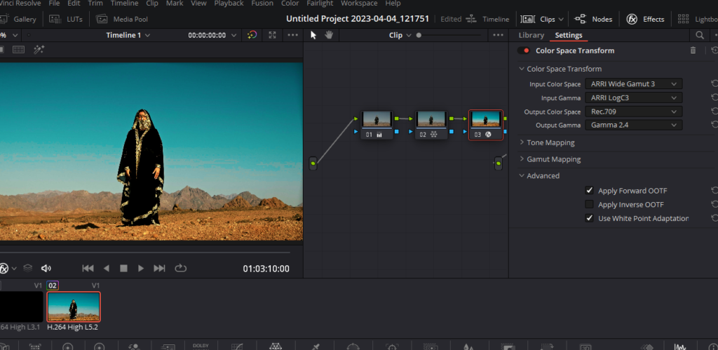
A Practical Example: To better grasp the concept, consider a scenario where your footage is shot in Arri LogC:
- For Input Color Space, choose ‘Arri Wide Gamut 3’ from the dropdown.
- Set Input Gamma to ‘Arri LogC3’.
- For Output Color Space, pick ‘Rec.709’.
- Lastly, for Output Gamma, go with ‘Gamma 2.4’.
Key Notes for Personalizing Your Settings: Remember, the Input and Output color spaces are intrinsically linked to your shooting conditions. For instance:
- The Input color space correlates directly with the camera model and the color space you opted for during the shoot.
- The Output color space, on the other hand, is influenced by your intended delivery platform. A prevalent standard for web deliveries is ‘Rec.709 Gamma 2.4’.
Tone Mapping Setting In Color Space Transform
Once you’ve set up the ideal color space, you’ll notice an option labeled “Tone Mapping”. The purpose of the Tone Mapping Method is to enable a smooth transformation between color spaces with varying dynamic ranges. It aids in avoiding hard cuts in colors and ensures the preservation of image details by managing the contrast. This results in a visually pleasing outcome without any unpleasant clipping.
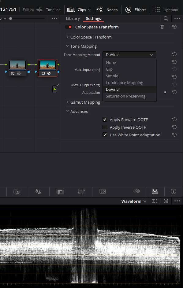
Navigating the ‘Tone Mapping Method’ Options: While the default ‘DaVinci’ setting is often a reliable choice, DaVinci Resolve offers a plethora of other options, each catering to different needs and scenarios. Here’s a breakdown:
- None: This disables Input DRT Tone Mapping. It’s a straightforward mapping to the Timeline Color Space without any adjustments.
- Clip: As the name suggests, this option will hard clip any values that go beyond the set boundaries.
- Simple: This uses a basic curve to manage the contrast, especially focusing on the highlights and shadows. However, it has its limitations when working with HDR sources exceeding 5500 nits.
- Luminance Mapping: An alternative to ‘DaVinci’, this is ideal when your Input Color Space is standardized, like Rec. 709 or Rec. 2020.
- DaVinci: This provides a smooth luminance roll-off and controlled desaturation, especially in extreme bright or dark areas. It’s an excellent choice for mixing media from various camera sources.
- Saturation Preserving: For colorists who prefer intense colors, this option maintains saturation in the highlights and shadows. Yet, to avoid unnatural looks due to over-saturation, two additional parameters are available:
- Sat. Rolloff Start: Defines the luminance threshold where saturation starts to decrease.
- Sat. Rolloff Limit: Sets the luminance limit where the image becomes completely desaturated.
Other options in Tone Mapping Section:
- Use Custom Max Input / Output:
- Purpose: These options provide granular control over the luminance range of your input image.
- How to Use: By checking the respective boxes and moving the adjacent sliders, you determine the minimum and maximum luminance values (measured in nits) for your input image. When adjusting these in tandem, you’re essentially mapping a specific luminance value from the Input Gamma to a corresponding value in the Output Gamma. This capability ensures the transformed image remains faithful to your vision and original source.
- Adaptation:
- Purpose: This adjustment is all about perception. It compensates for differences in how an image is viewed based on its brightness and the type of display it’s viewed on. Given that an HDR display can make a bright image pop significantly more than an SDR display, the adaptation setting aims to bridge that gap.
- How to Use: The setting operates on a scale, and for a majority of “average” images, a value between 0-10 is optimal. But, let’s say you’re working with a particularly luminous image – like a midday snow scene. In such cases, ramping up the adaptation value can assist in preserving and accentuating the details in those bright highlights.
Gamut Mapping Setting In Color Space Transform
Once you’ve adjusted Tone Mapping, the next thing is Gamut Mapping in color space transform. Offered in the Color Space Transform plug-in, Gamut Mapping controls help in workflows where you need to switch between color spaces with significantly different gamuts. These controls are reminiscent of the ones present in the Color Management panel under Project Settings.
Diving Deeper into Gamut Mapping Method
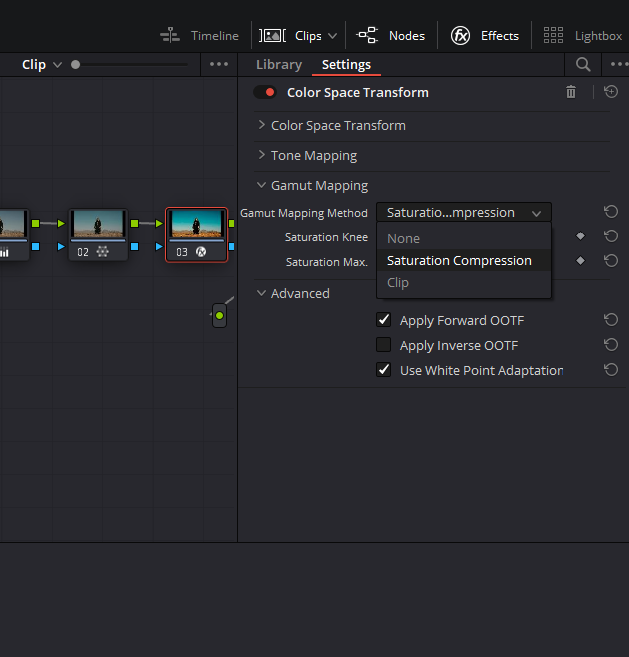
This method ensures smooth transitions when moving between significantly different color spaces by regulating image saturation to produce visually pleasing and natural results devoid of any clipping. Three distinct methods can be selected from the drop-down list:
- None: Again, this means there’s no gamut mapping.
- Saturation Compression: This adjusts the saturation values to fit between the Input and Output Color Space and Gamma. It offers:
- Saturation Knee: Determines the onset of saturation remapping. Below this, no adjustments take place. All subsequent values are altered based on the Saturation Max slider. A 1.0 value signifies peak saturation in the chosen output space.
- Saturation Max: Dictates the upper saturation threshold beyond the Saturation Knee setting.
- Clip: This method hard clips any saturation values that don’t fit within the gamut.
Navigating Advanced Features in DaVinci Resolve’s Color Space Transform
After exploring Tone and Gamut Mapping, let’s cast our spotlight on another crucial area: the “Advanced” options in Color Space Transform.
1. Unpacking the “Advanced” Drop-down Menu
Located at the base of Color Space Transform, the “Advanced” menu unfolds a range of sophisticated functionalities inherent to the Color Space Transform effect. This segment assists colorists in achieving more nuanced and detailed adjustments.
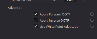
2. The Role of White Point Adaptation
Among the primary features is the option to ‘Use white point adaptation’. This pertains to the adaptation of color in relation to white points between different color spaces. Here’s a closer look:
- No White Point Adaptation: By unchecking this box, the original white point of the input color space remains untouched when viewed in the output color space. This option proves beneficial when you wish to retain the original white point for comparison purposes, such as using a P3-D60 mastered clip within a P3-D65 timeline for reference.
- Applying White Point Adaptation: Checking this box engages the chromatic adaptation transform. The purpose is to align the white point of the input color space with that of the output color space. This becomes essential when integrating clips from varied mastering sources, ensuring a consistent appearance. An instance would be adapting a P3-D60 mastered clip to seamlessly blend with clips mastered for a P3-D65 timeline.
Last Words
Color Space Transform in DaVinci Resolve is a potent tool that opens doors to a realm of precision and creativity. As we’ve delved into its depths, it’s evident that this feature, while intricate, offers a systematic approach to color management and grading. By mastering its various functionalities, filmmakers and colorists can ensure their work resonates with visual excellence across all viewing platforms. As you embark on your color grading journey, remember to experiment, explore, and most importantly, trust your vision. After all, the magic lies in those subtle hues and gradations that breathe life into every frame. Happy grading!